
Wherever we look, colour surrounds us and plays a hugely influential role in shaping our first impressions, decisions and emotions. Our Studio team explore the psychology behind the palette, uncovering how colour influences branding, marketing strategy and the importance of emotional connections with brands.
Choosing the correct colour for a product or brand goes way beyond making it ‘look nice’; it’s an important strategic decision to evoke the right feeling, meaning and connection.
Think of your favourite story – when a writer uses a certain colour, it’s rarely accidental. For example, a deep red may symbolise love, passion, danger or maybe even power. Or a green evokes imagery of nature, growth, sustainability. The list is limitless. What this demonstrates is that colour association is deeply rooted in human psychology and culture, and precisely the reason why colour plays such a powerful role in marketing and branding.
What’s more, colours hold different cultural significance, which is another big consideration when it comes to marketing. For example, traditionally, black is symbolic of grief and worn to a funeral in the West, but this isn’t the case on a global scale. And this is something that marketers also need to be mindful of when it comes to their strategy.
What makes a brand stand out with colour alone?
You can tell a brand has truly hit the nail on the head when it comes to their colour choices when they’re instantly identified by their palette alone.
McDonald’s – the iconic bold red, yellow and white; Netflix – the gleaming red against the black background; Tesco – the bold blue, red and white tricolour; they’re all branding giants for a reason.
They’ve taken the time to consider colour psychology, thinking deeply about how their audience will respond to them, and been deliberate in their approach to build those feelings of excitement and familiarity. Every shade used in an advert, website, showroom or social post is part of a larger message, and even subtle changes in tone can completely alter how a campaign feels to an audience.
Let’s ask Denfield’s design experts!
So, without further ado, let’s hear directly from the designers at Denfield as they share their expert insights, creative thinking and real-world examples of how effective colour choices can strengthen branding and bring businesses to life.
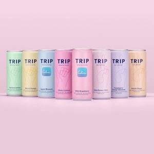
Katie: “TRIP Drinks’ colour choices feel fresh, modern and relevant. Not only do the colours work beautifully in social media, but they also stand out so well in a busy pub fridge against all the other darker and brighter colours making it instantly recognisable when looking for an alcohol alternative for the current wellness culture.”

Emily: “I think Škoda’s use of a neon digital green in their last rebrand really stands out. Most other manufacturers have pretty much dialled back all colour to just black or white. I like that Škoda doubled down on the green; it makes them stand out from the others now.”
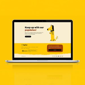
Becca: “My favourite colour to use in design is a bright, sunny yellow – it makes me happy when I see it out in the wild and can bring a real sense of fun to a design. A great example of this is in the Dogs Trust brand refresh, where colour and illustration come together to create a really playful identity that’s full of character!”

Lynda: “I’d pick green as a favourite colour to work with; it encompasses so many things as there are so many variants. From the bright lime green end of the scale for vibrancy and freshness right through to the deeper, earthier greens that give us the feel of nature and being eco conscious.
“It has such impact because it’s so universally understood as the colour of the environment and the natural world that it can quickly convey these vibes to an audience at a glance.
“For work where I feel it’s effectively used – if we’re talking about our work here at Denfield – I’d pick Chester Zoo: the deep tone of their core green is so embedded in their brand that it instantly links to their core message of conservation, and when combined in print with the uncoated texture of the paper stock it screams eco conscious/recyclable.
“If we’re looking at design/branding we’ve not worked with, but where I feel the colour palette has been used well, I’d go with Suri as a brand – earthy tones, muted palette while still being colourful; I think it really creates the right tone for their messaging.”

Dan: “I personally prefer oranges and yellows as bright beacons in advertising, but, of course, it all depends on the client’s brand guidelines. Colour is a very powerful way of theming a piece of creative and grabbing attention, but it is also a useful tool for organising a layout, highlighting key details and separating different sections of information.
“The piece I’m working on currently is an automotive advertising campaign with a football theme, so I am using red and blue as typical football colours to work with the theme. The vehicles are red and blue to compliment the theme, and both colours are used in the background, foreground and highlights in a way that is balanced to lead the eye around the design.”
Jake: “I’m easily persuaded by that popular range of natural, earthy oranges and reds these days. Clay, terracotta, that kind of thing. Always quite calming and reassuring, and it’s used so often by natural or sustainable brands as a base colour. That and I just like autumn colours!”
Rob: “I simply can’t choose! A big part of being a designer is picking what’s best for the job and I don’t really have an opinion on my favourite colour. What can be impactful in one job, might not be impactful on another. It all depends on what the campaign or creative is calling for.”
Paul: “I wouldn’t say I have a favourite colour to use in design, as a lot of the time we’re working with colours already tied to the clients’ branding or pairing them with the product/business sector they are in.
“In terms of a colour I probably use most often, I’d say blue. It’s not too harsh visually, and is often associated with trust, reliability, etc., which makes it a popular choice.”
Creating emotional connections through colour
So the next time you see an advert, scroll past a social post or walk into a showroom, pay attention to the colours being used. People may forget statistics or specifications, but they remember how something made them feel. The right use of colour can make a campaign feel exciting, comforting, premium, adventurous or modern within seconds.
That’s why at Denfield colour is always considered carefully and strategically as part of the creative process. Our team understand how powerful colour psychology can be in shaping perception, building emotional connections and helping brands stand out in competitive markets.
Whether it’s developing a bold new campaign, refreshing a brand identity or creating impactful marketing materials, we focus on using colour intentionally to achieve the right response from your audience.
Which colours resonate most with you? Which colour choices do you think stand out in ads?
Ready to
work with us?
Want to collaborate?
Work with us
info@denfield.co.uk
Want to say hello?
Call us
01926 881178
